SPANDREL BREWING COMPANY
Spandrel (noun):
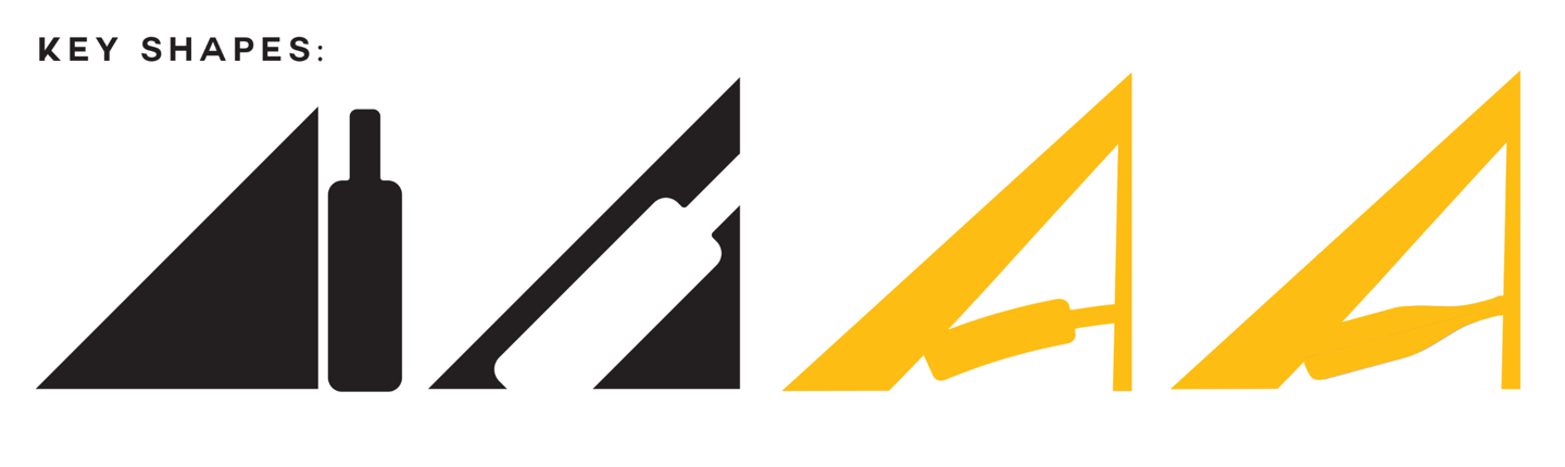
The triangular
space beneath
the string
of a stair
MEAD (NOUN:)
a fermented
beverage made
of water and
honey, malt,
and yeast
• Cozy • Old & worn • Hearty • Natural • Dignified, elegant
PART I: INITIAL ANALYSIS
• 7 letters in the word "Spandrel"
• "A" identified as letter with highest potential of visual interest
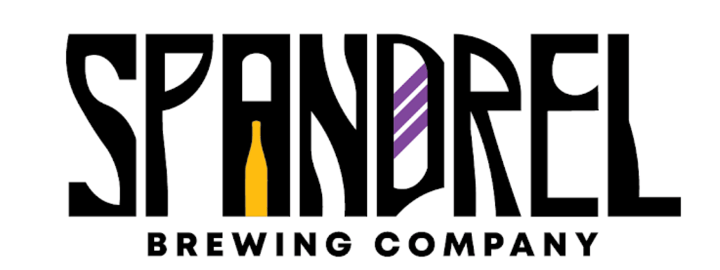
According to the above definition from the Merriam Webster dictionary, a spandrel typically forms a right triangle underneath a staircase. The above image reflects initial experiments with incorporating a bottle shape and a right triangle shape to form the letter "A."
Some initial vector lettering is created. The mood is light and friendly. These versions highlight the abstraction of the "A" shape, and focus on different ways in which a bottle shape can mimic its form by pointing up toward its apex. Finally, there are variations on liquid flowing from the mouth of the bottle into the next letter in sequence, "N."
PART II: First PASs
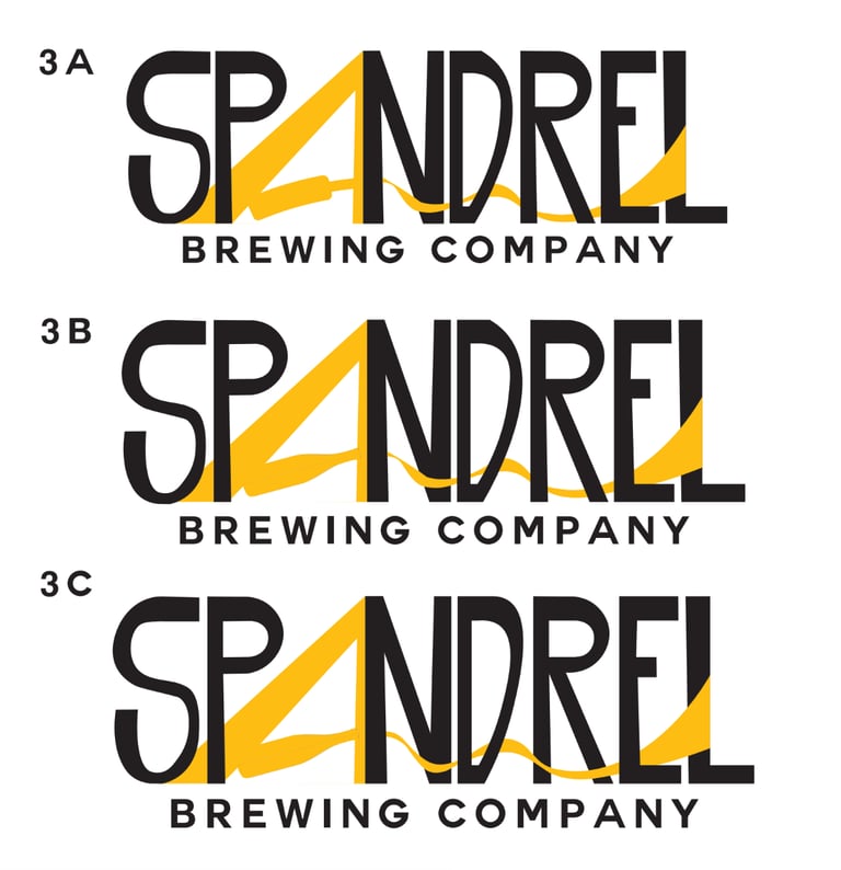
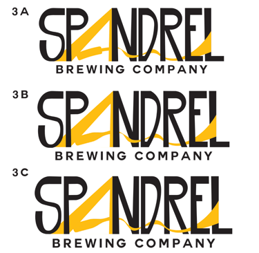
These versions develop a stronger visual identity by pushing the idea of "pour" and "flow." Rather than flowing into a singular letter, the liquid becomes incorporated throughout the whole word, effectively unifying it. The "A" emerges more clearly as it utilizes negative space. The bottle is transformed into a typical shape for a mead bottle.
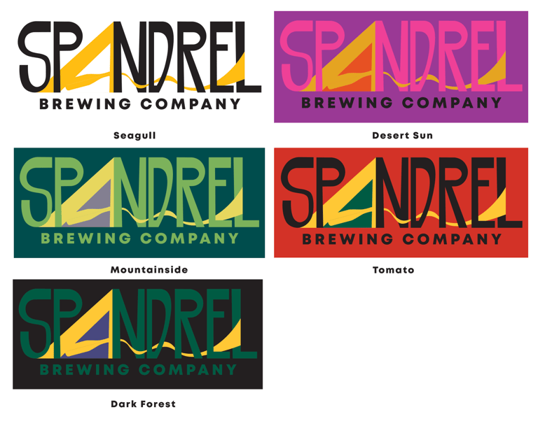
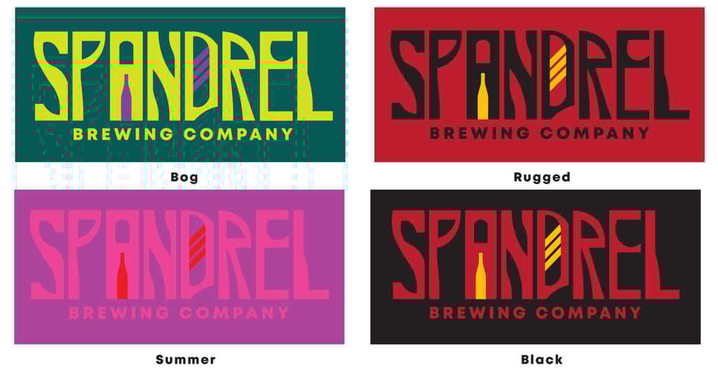
Finally, 3C is incorporated into experiments with various color schemes. Each color scheme is given a themed name according to the individual mood it provokes. Some color schemes are bold, others are muted. Each design is imagined as potential prototypes for merchandise like stickers or emblems on clothing.
Mead is traditionally known as the world's most ancient alcoholic drink. It is recognized as a prevalent beverage throughout the Medieval era, and is often associated with jubilant celebrations of heroes and deities. Nature is a central theme of its production: the key ingredient, honey, is a naturally fermentable sugar produced by bees. Each of these qualities became important in rethinking the logo's look and feel. In order to gain a full perspective of the lettering's potential, full sets of alphabetic type were created.
PART III: VIBE CHECK
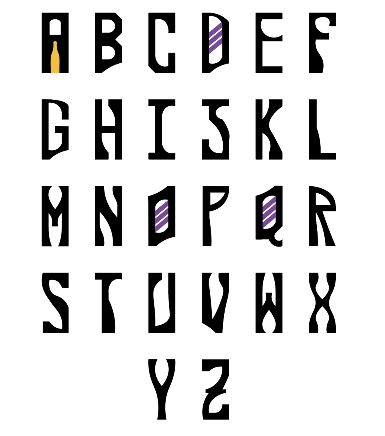
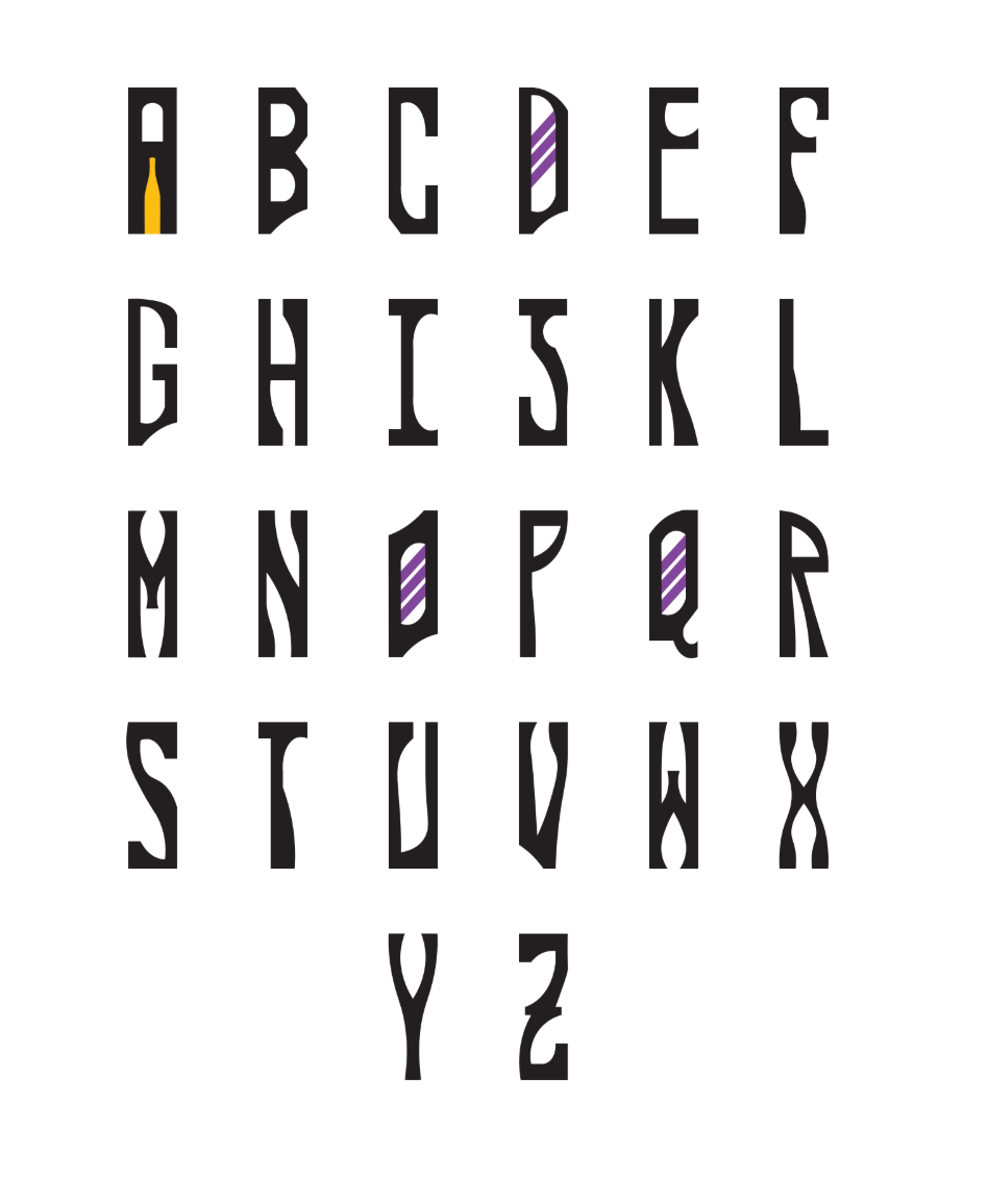
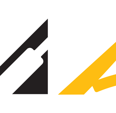
The letter "A" remains a central visual player in the spread, along with the choice to reframe the bottle inside it.
The tapering of the letters was designed with undulating tree branches in mind, as well as other natural elements such as leaves ("F," "S," "U," and "V"). The thick black linework, soft arch cuts, and gently opposing curves between each letter evoke a sense of mystery and wonder that one might find in an ancient, thick forest. There is a handcut feel.
Letters "I," "L," "M," "P," "T," and "Y" stand staunchly erect, as might medieval soldiers standing guard.
Lastly, the addition of the three purple stripes in the negative space of "D," "O," and "Q" elevate the lettering so that the brand feels like one of high, even royal, distinction.
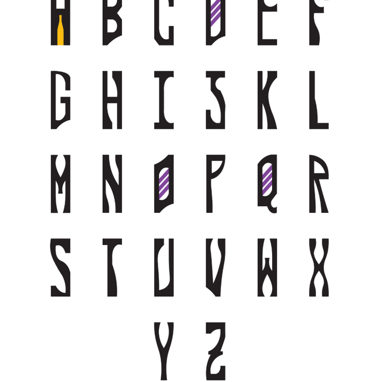
This version of the lettering is narrowed by 25%. This effect makes the letters feel more brittle, as if they may snap if handled too harshly. The natural motifs generate a feeling of purity.
This version of the lettering was selected for the final logo because it allowed for a more clean and tightly arranged letter sequence, and because the narrow frames more strongly emulated the qualities of a glass bottle.
The thin version of the lettering reflects the character of the brand as one that is fine and delicate on the outside, and strong and bold at heart - as is the mead it produces.
The original vector lettering imagines how each letter in the alphabet may correspond to the clarified themes of the brand in their own unique ways.
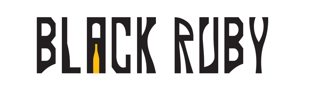
Here, the chosen lettering is used to experiment with the name of Spandrel's flagship mead, "Black Ruby."
PART IV: Second pass
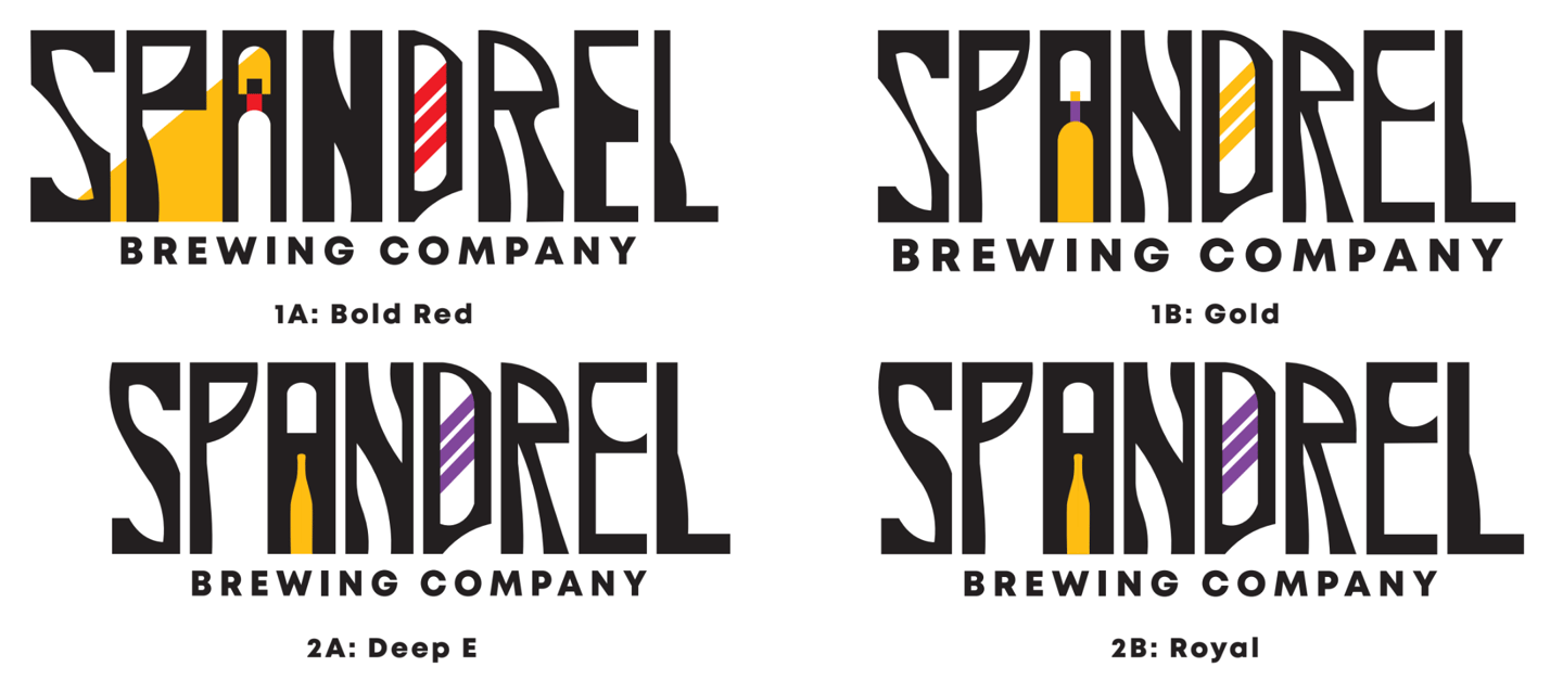
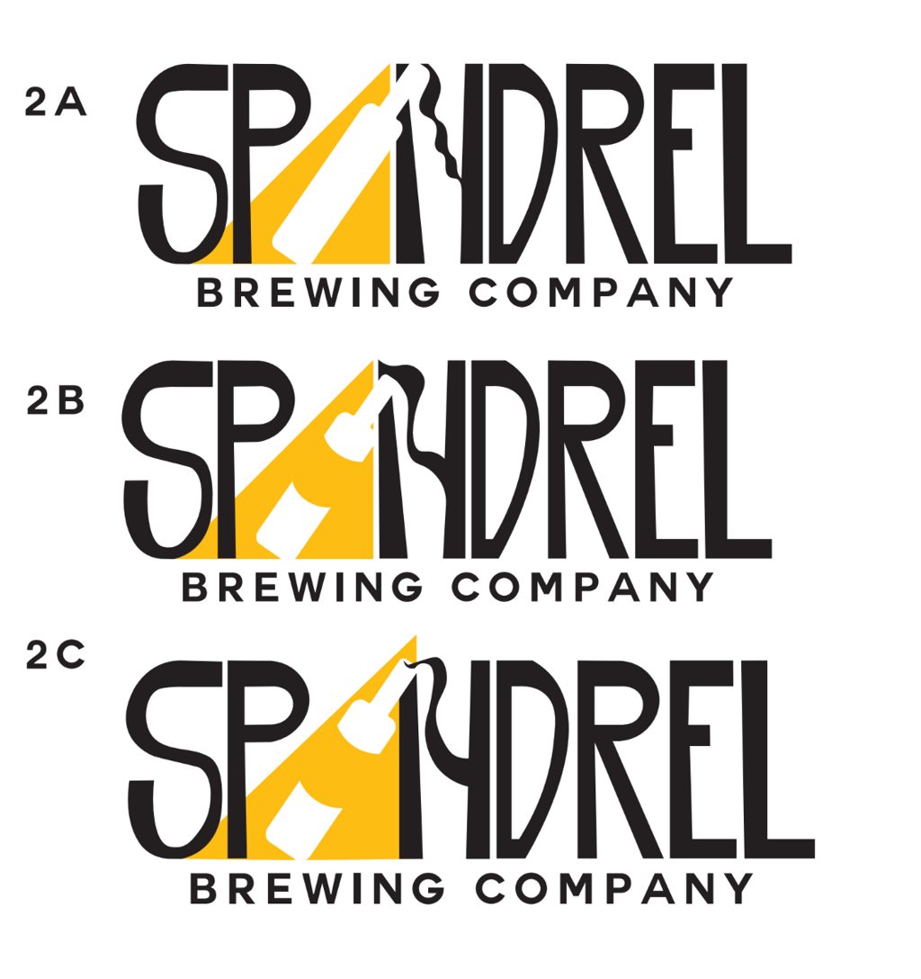
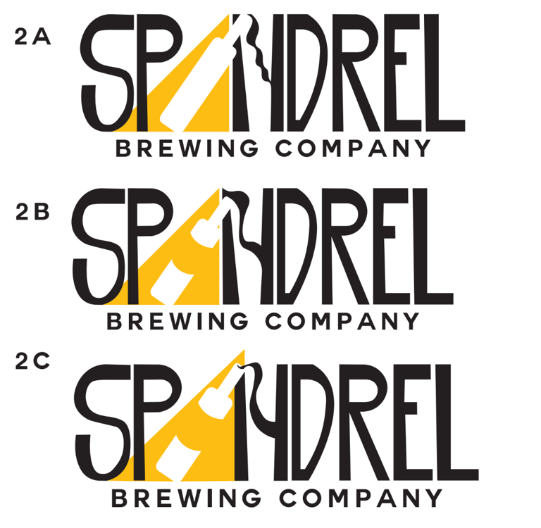
The design's second pass explores more intimate variations on shape, color, and text size. 2A and 2B are only distinguished by the size of the upper chamber in the "E." The "E" in 2A appears more wine-glass shaped, while the "E" in 2B more cohesively matches the other letters. While the colored label in the bottle necks of 1A and 1B added a pleasant visual note, 2B was ultimately selected as the final design.
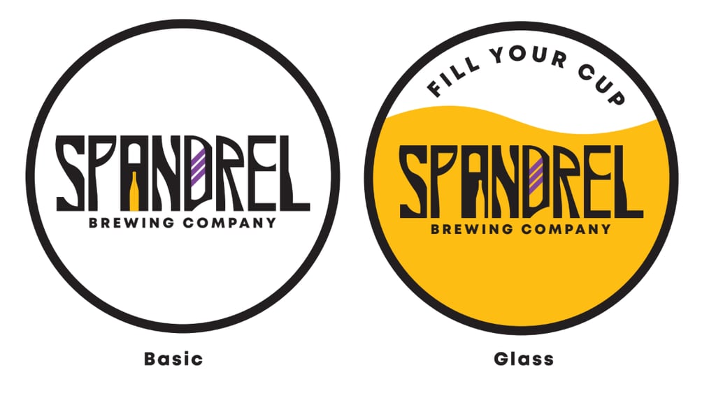
From there, the chosen design was applied to circular shapes in order to experiment with potential label designs for mead bottles. In "Glass," the circular shape mimics a wine glass flowing heartily with honey-colored liquid as if in the midst of a toast. The bottle in the "A" is made slightly askew to explore asymmetry: it does not stick. The phrase in bold, "Fill Your Cup," is drawn from the jovial spirit associated with the consumption of mead during large convivial occasions.
The final logo design, complete with updated color scheme tests below.