Sound mind restoration
and wellness center
Part I: Initial Analysis
• Sense of wholeness
• Feelings of peace, inside and out
• Fragmentation of spirit
• Nurture, tenderness
• Elegance, refined feeling
Client must haves:
Initial Visual translation:
• Circle
• Dove
• Exploration of pieces
• Hands
• Simple and modern feel
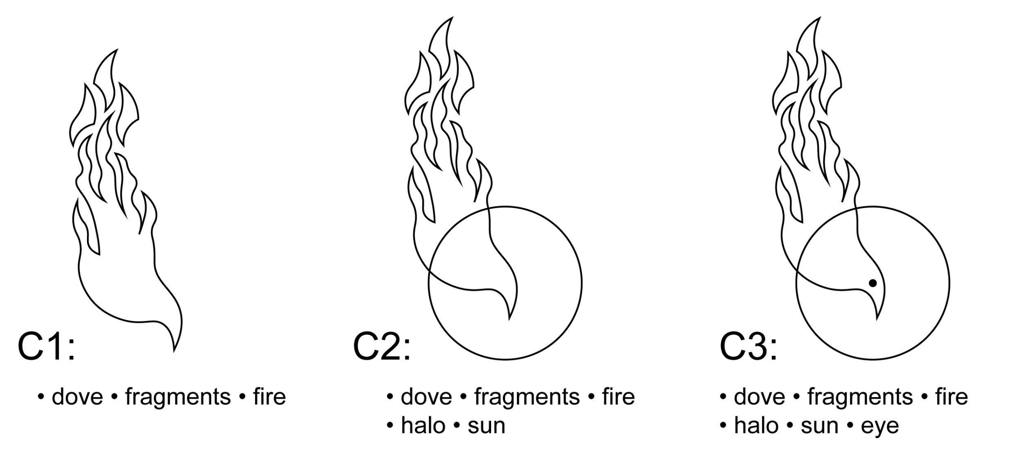
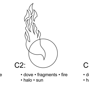
In its early stages, the design focused on the image of a dove. It was important to the client to ensure that the dove remained distinct from any one religious connotation, and instead inspired a general sense of purity in spirit. The thin, clean linework moving in flowing shapes creates a crisp, modern feel. The five tails on the dove mimic the shape of a hand.
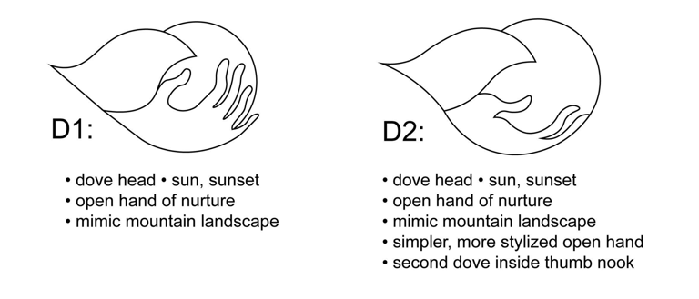
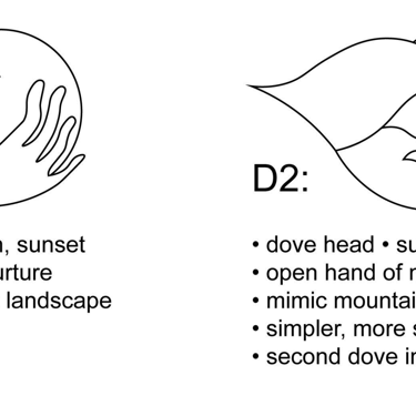
Next, the hand entered the design as the primary figure in the exploration, while the dove moved to the background of focus as an abstraction. The visual note that would become the key feature in the final design first arrives in D2, in which there is a smaller dove that emerges from the negative space generated by the crook of the thumb in the hand.
Part II: First pass
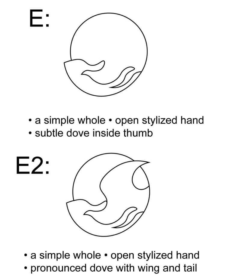
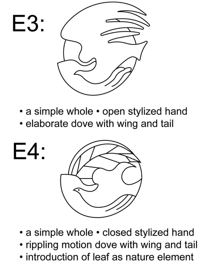
Throughout the E series, each iteration takes a different approach to the logo while keeping the constant of the dove head appearing in the thumb. The logos become more complex in ascending order. E4 incorporates a new element, a leaf, to speak to the desire for natural symbolism. When presented to the client, the stylized hand in E4 was identified as the next key feature in the final design.
Part III: SECOND pass
Client's desired CONstants Moving Forward:
• E4 hand
• Dove with eye
• Flared dove tail
• Natural elements
Experiment points:
• Unbroken and broken circles
• Addition of an olive branch
• Olive branch leaves as fragments
• Emphasis on continuous flow throughout
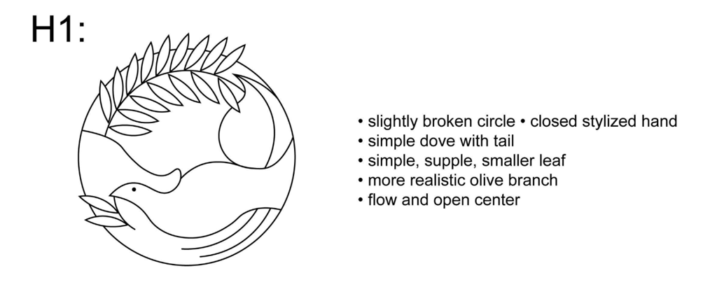
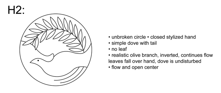
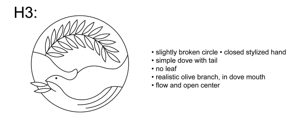
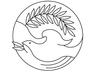
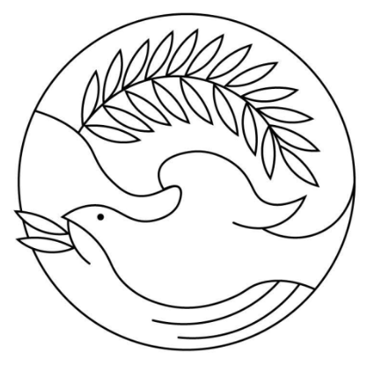
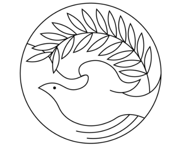
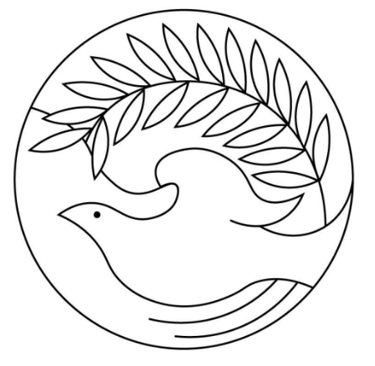
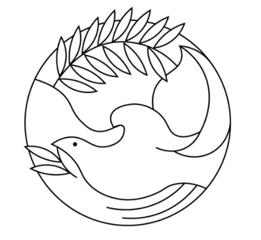
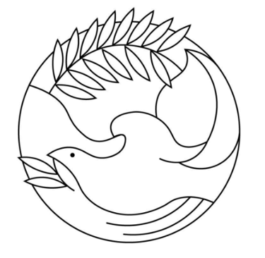
The H series emphasizes the olive branch as a central element. The stylized hand remains, and the dove is simplified. The olive branch variations in this series explore different directional flows, as well as experiments with the breaking of the circle. There are explorations of the olive branch being clasped in the dove's mouth. The logos on the right hand side reflect virtually the same designs, with the exception of the dove gaining a wing.
For the final logo, earth tone colors were selected: terracotta, slate green, and sandy brown. The olive branch was selected to move in a clockwise direction, creating opposing visual flows. This creates a sense of balance and movement: the dove moves against the flow of the other elements, and is directly met by a warm, nurturing hand ready to uplift it. These choices generate a sense of gentle optimism and perseverance through personal struggles of mind, body, and spirit.